PACKAGING
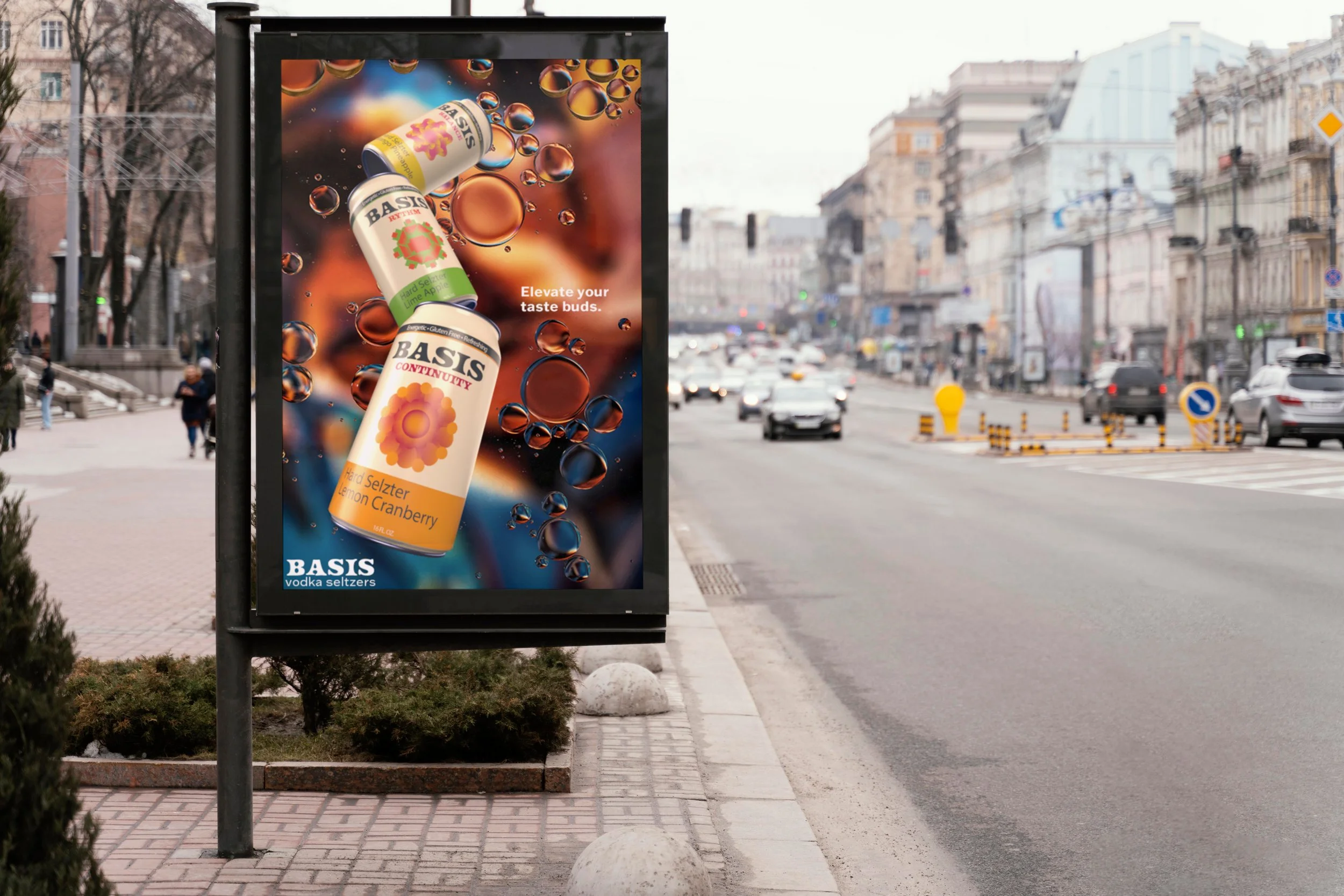
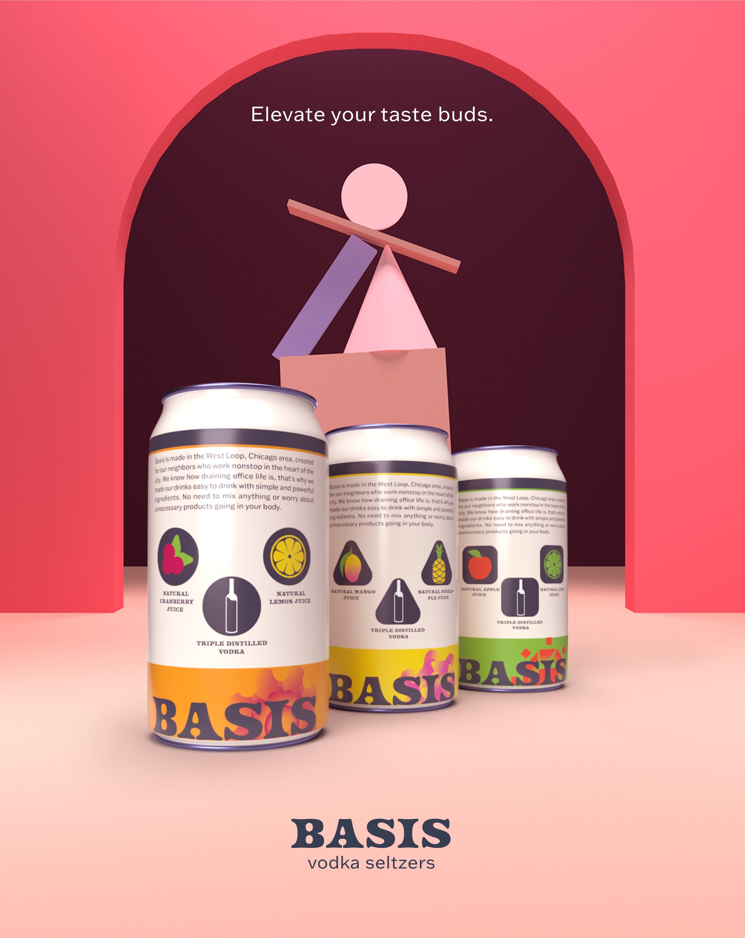
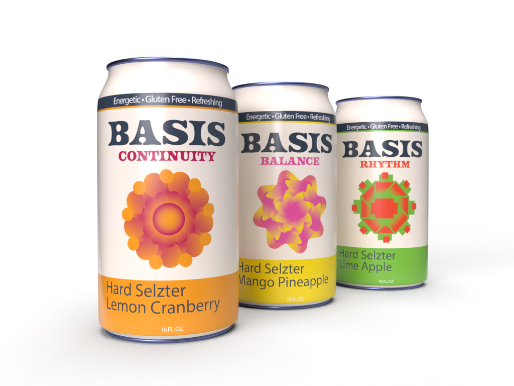
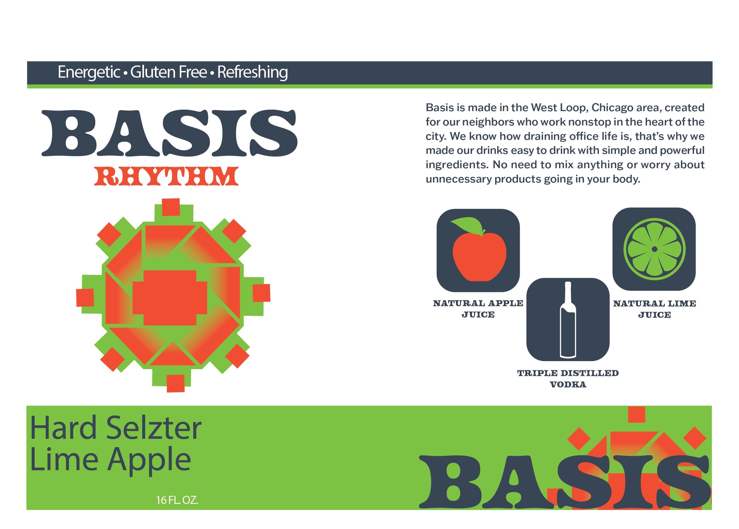
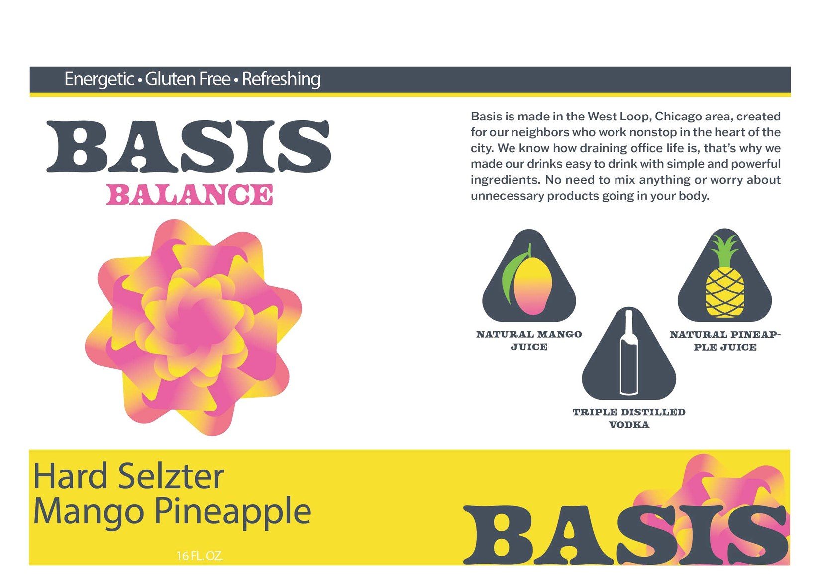
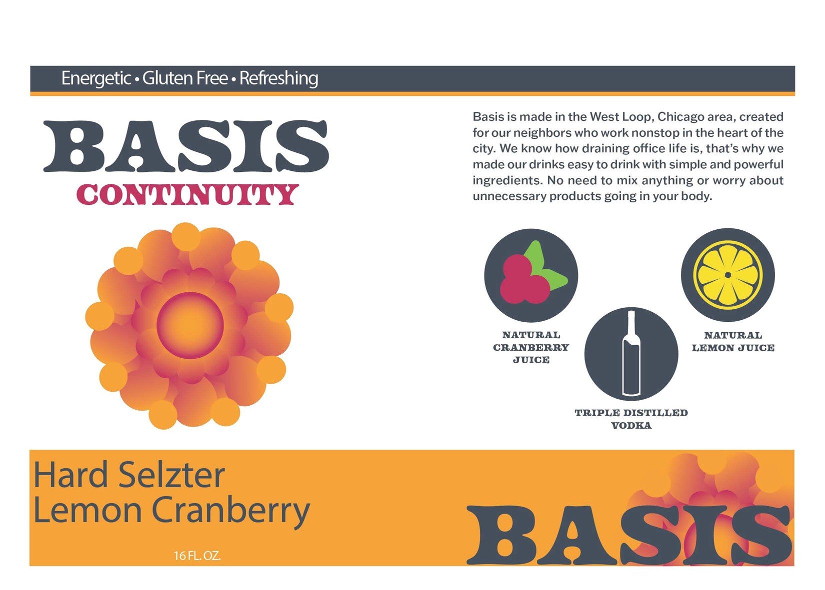
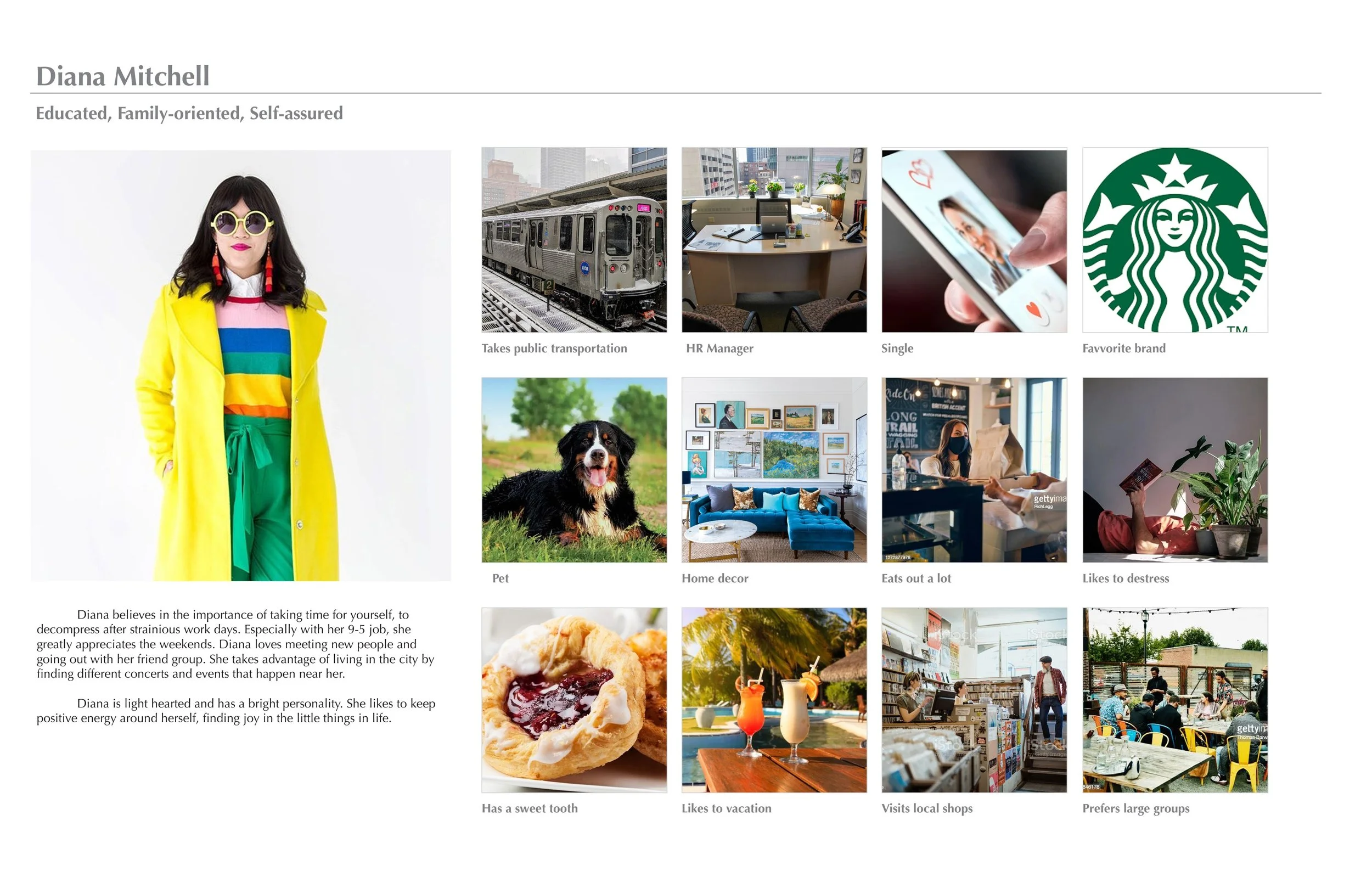
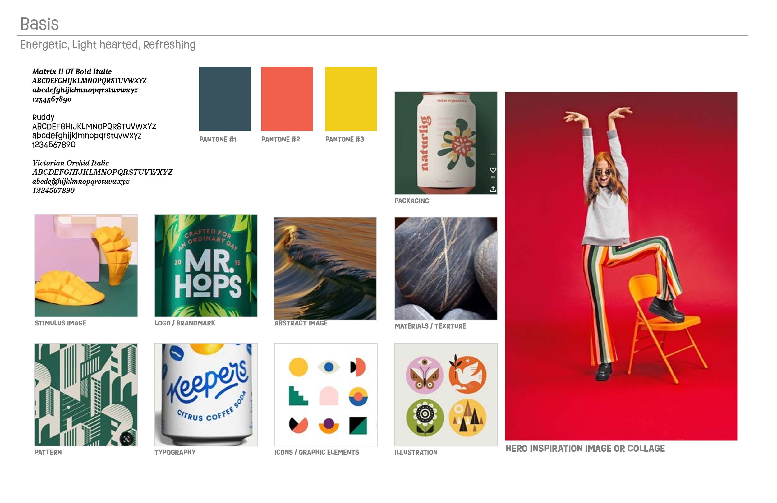
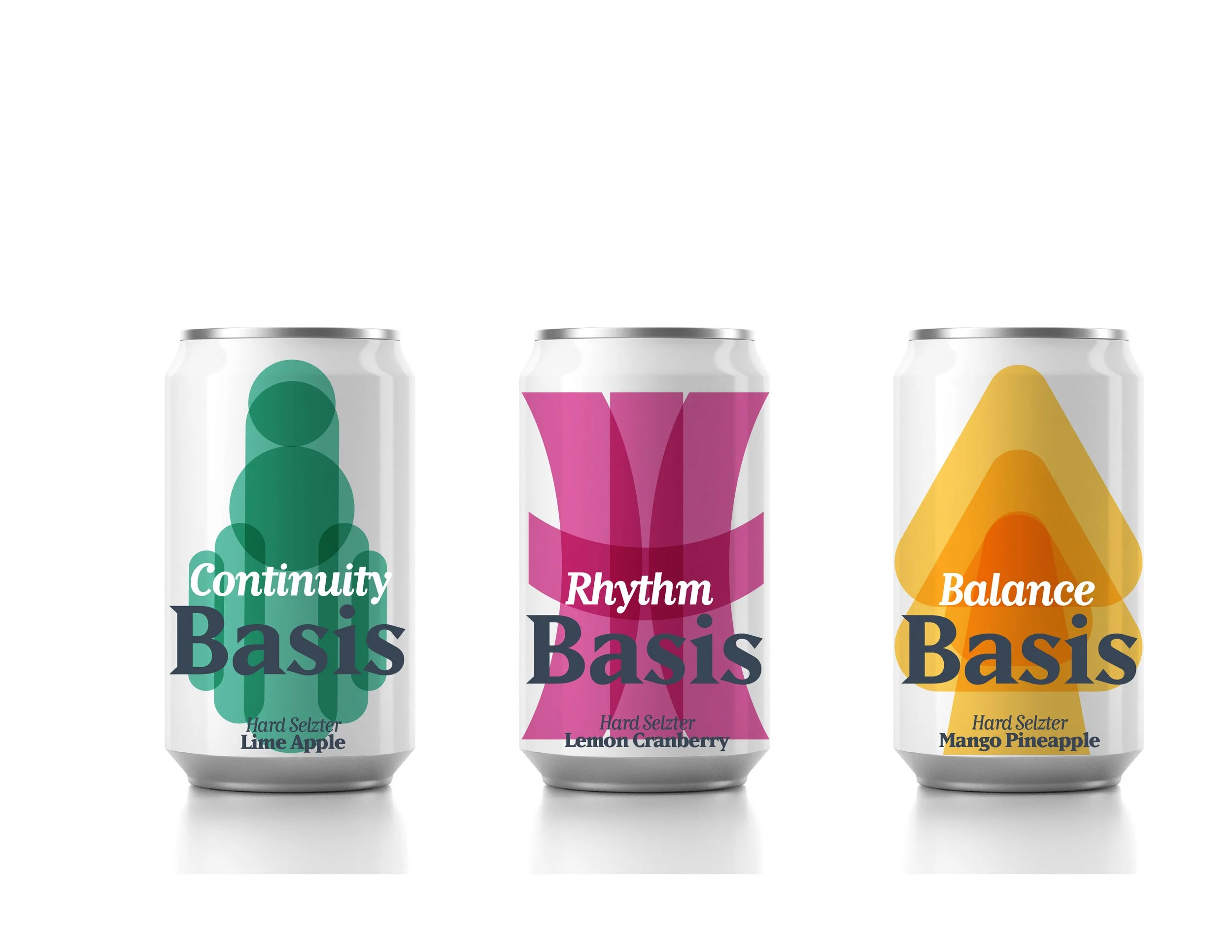
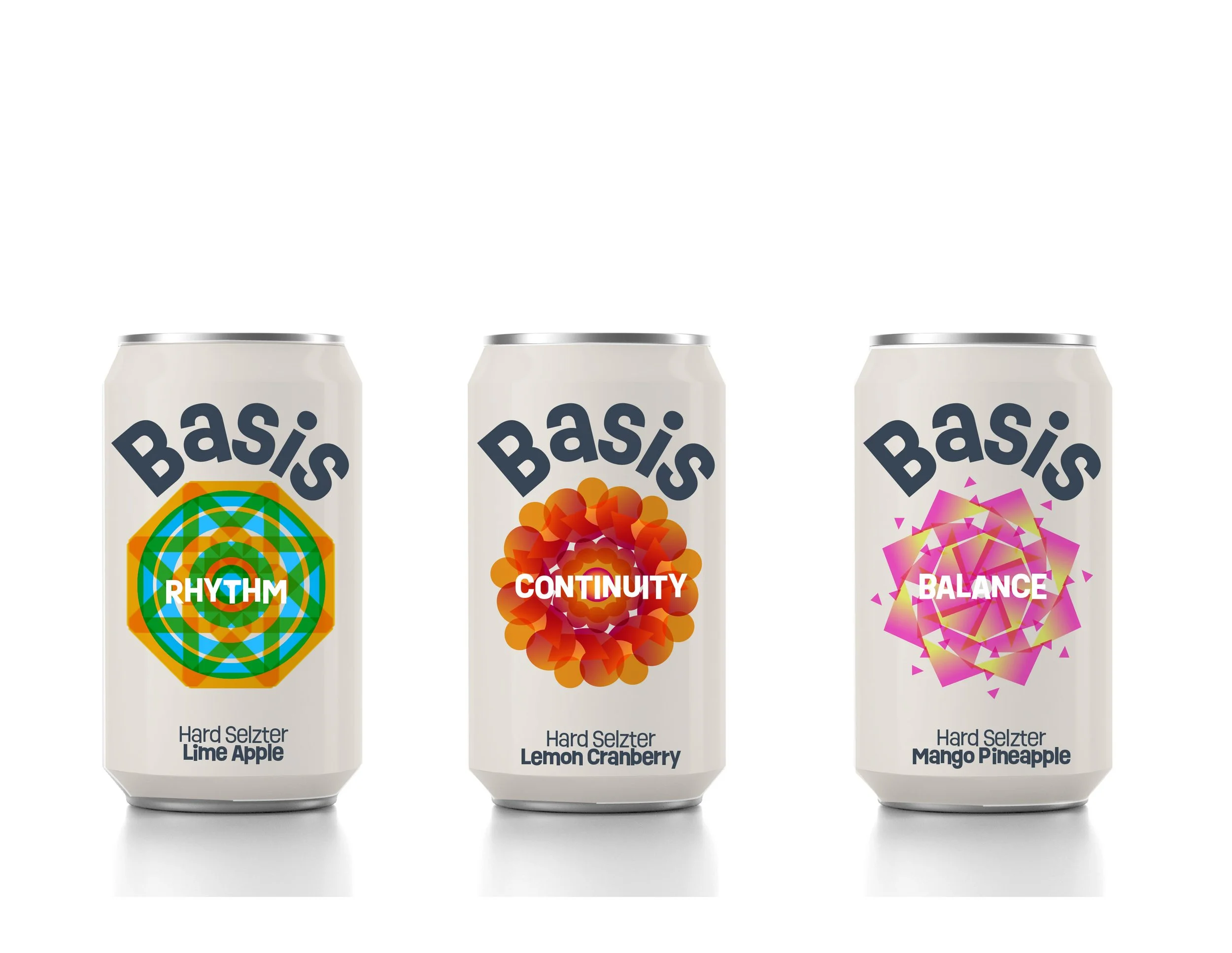
This project asked for a set of aluminum can designs that had to correspond with a distinct visual system that represented three flavors. This was accomplished through developing a target consumer and the visual attributes that would appeal to this persona. The three flavors were separated into concepts of “rhythm”, “continuity” and “balance”, and had to appropriately represent the definitions of those concepts visually. After the three designs were finalized, they were fully displayed on 3-D mock ups to fully visualize the concepts. From there advertisements were created, also based on the prior consumer profile.
