BRANDING/VISUAL IDENTITY
The demand for reliable support systems has been constant within all POC groups living in America. Especially systems aimed towards empowering the women of these cultures. My own connection to the Mexican American community was the inspiration for the Chicana Empowerment Association. The purpose of the non-profit would be to provide safe networking channels, to help build community and sources of information. It also would offer professional mental health support, as well as financial advisors.
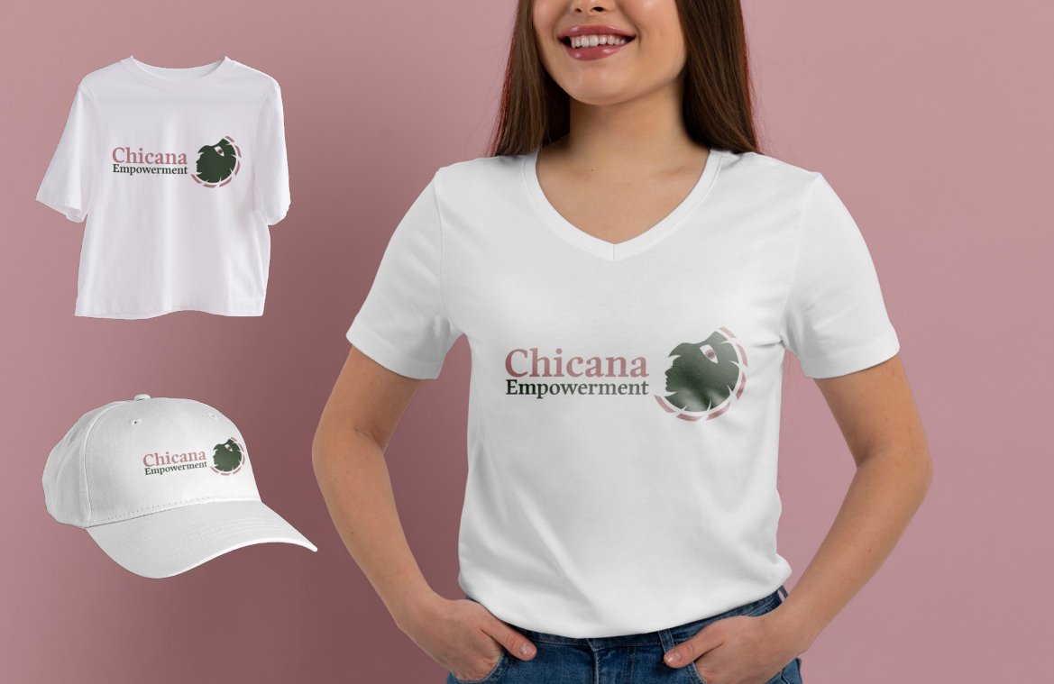
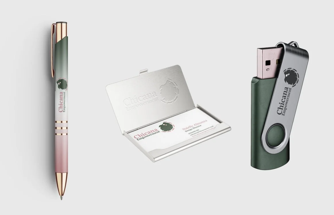
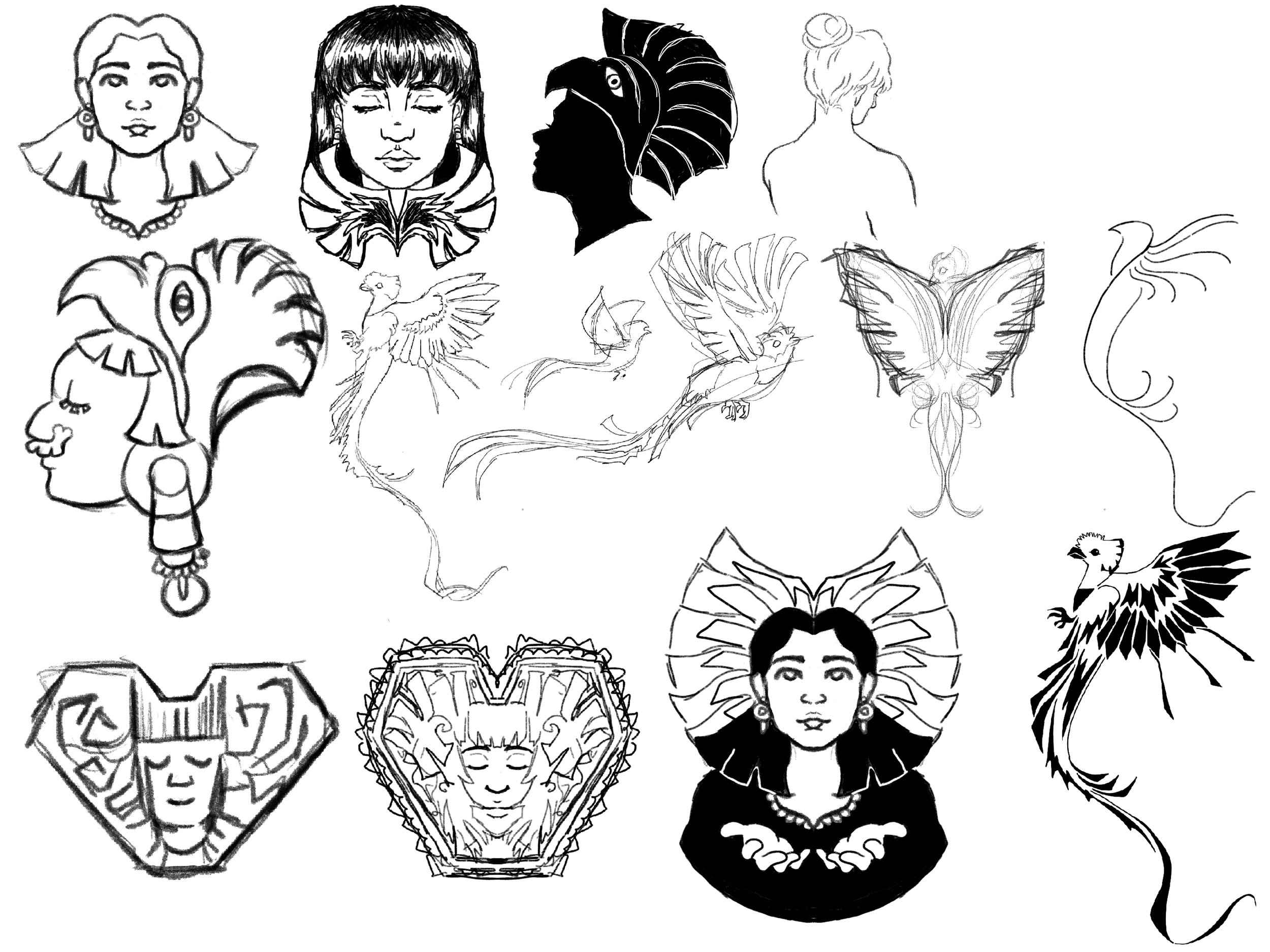
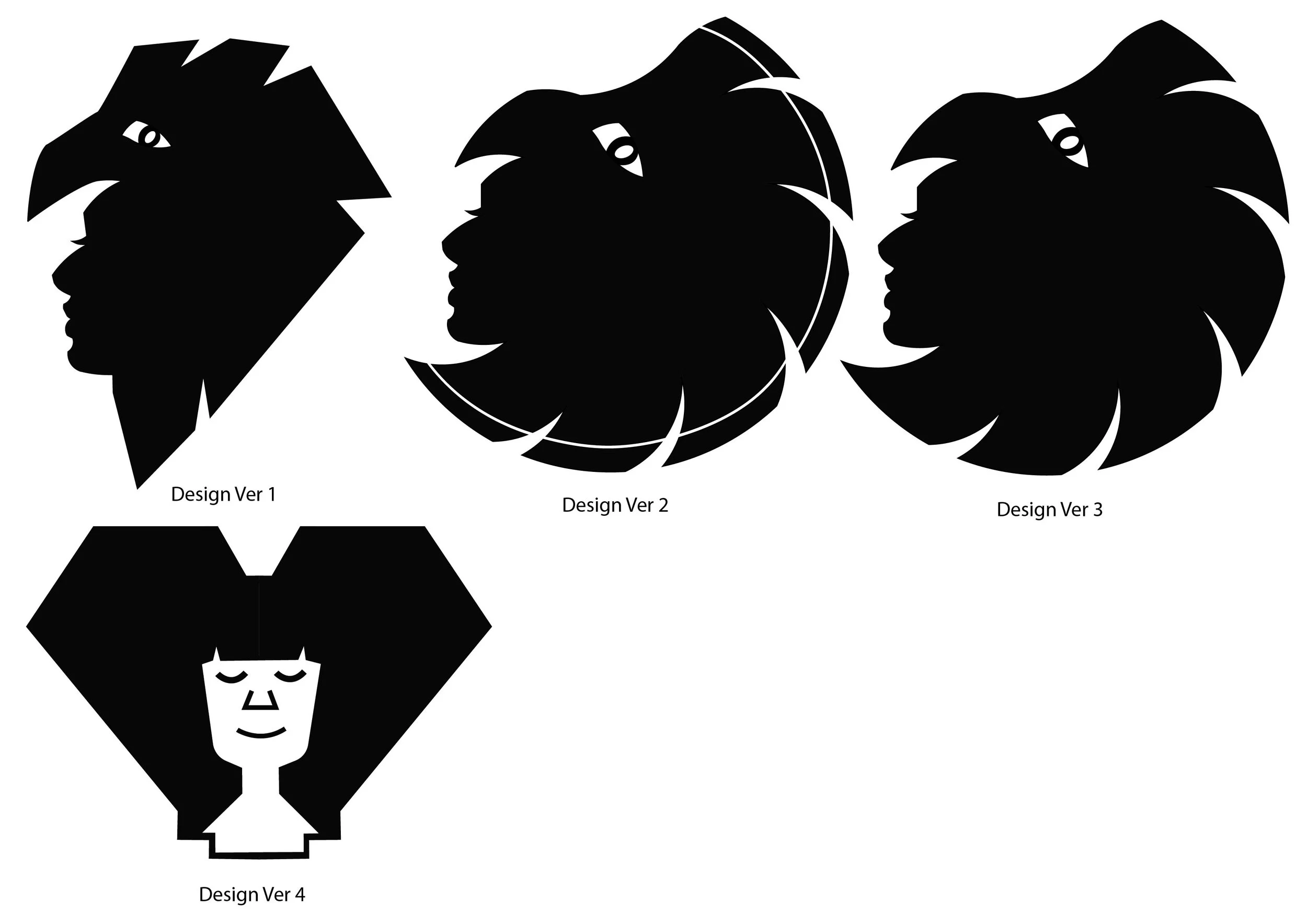
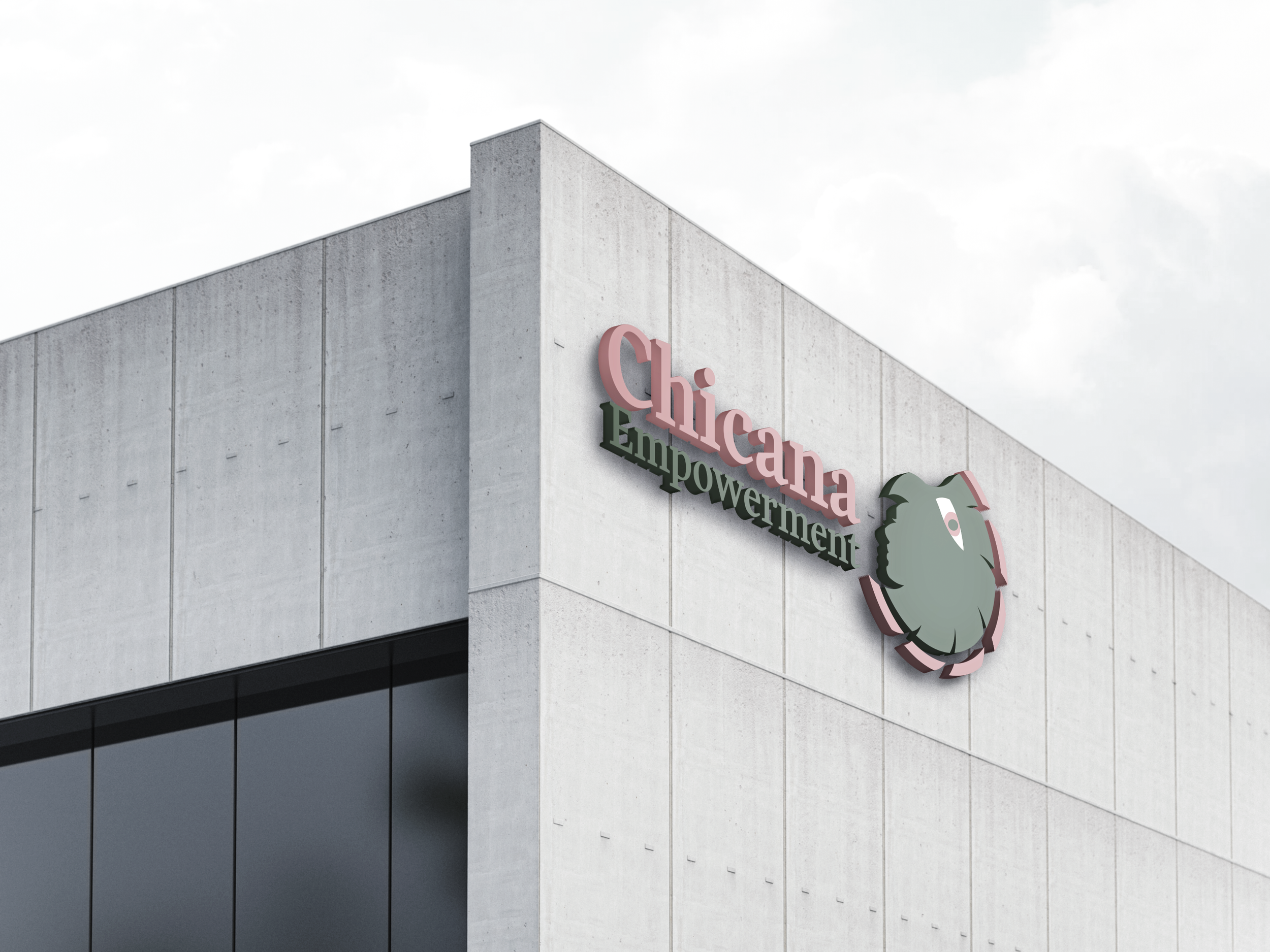
The association targets their services towards Mexican American women, aged 27-45. The brand image would aim to appear powerful and feminine, taking inspiration from the Aztec goddess Xochiquetzal. Her power is over fertility, sexuality, and household arts. The headdress that the goddess is often depicted in, which is the Quetzel bird, is referenced in the logo. There is also familiarity in the color palette, going off the red and green of the Mexican flag, though muted to maintain a calming energy.
